Often, I find people are afraid to ask “How did you do that?” If they do muster up the courage, I usually hear, “….if you don’t mind sharing your trade secrets.” There are no secrets. Just techniques and tips to make the journey to the final product a little less mysterious. Below, I will share the traditional techniques I choose to employ for layout and rendering as well as when I find modern technology to be helpful.


Let’s get started!
The process begins with a reference picture from the client. Sometimes I will receive a digital file through email. At times, an actual photograph will be brought to me, in which case I will use a flatbed scanner to create a digital file. Once created, the digital file will be imported to Adobe Lightroom for editing. At this stage I find technology extremely helpful. A good reference picture is a necessity for a great portrait. Lightroom allows the adjustment of light or exposure, sharpening of an image and color adjustment as needed. In the past, I would struggle with reference pictures that were out of focus or the subject was poorly lit. I even returned a few photographs because the quality of the photograph did not give me enough visual information to create a detailed portrait. Of course, there are many tips for taking better photographs, which I will detail in a later post, but the editing abilities of Lightroom have made this process a little bit easier.
Lightroom Editing


A good reference picture has well-defined shadows and highlights with clear focus. During Lightroom editing, I like to adjust the brightness and contrast first. I’ll then adjust mid-tones, sharpening and color as needed to enhance the reference picture.
Ground prep and Layout


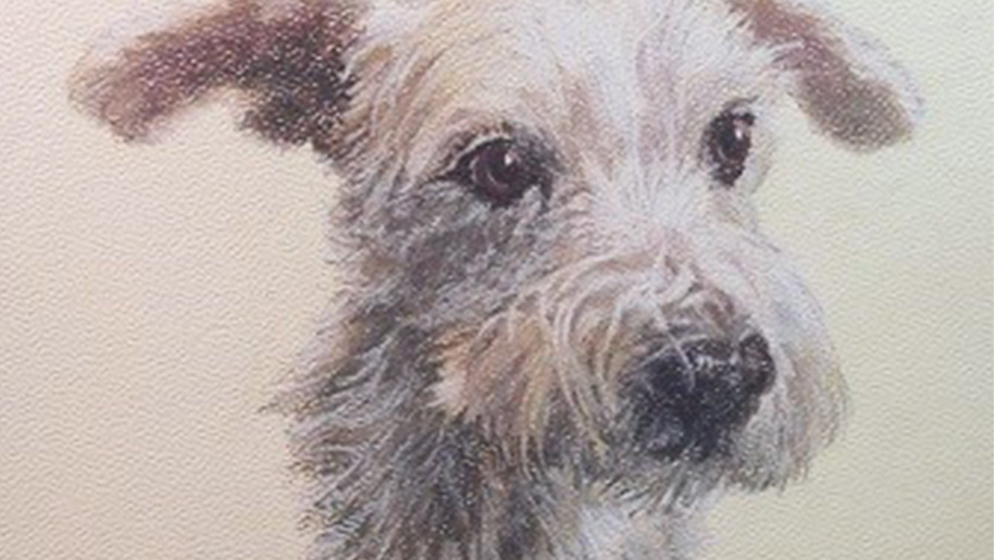
For Sherlock, I decided a ground of Mi-Teintes cream colored, textured pastel paper would be best. Since the portrait would be framed in a non-traditional manner, I spray mounted the pastel paper to a RagMat board for rigidity and placed it beneath a heavy chess board to ensure it dries flat. Once dry, I proceed with a traditional grid method in which I use a 4B pencil and very lightly, draw lines to divide the reference picture and ground in half horizontally and vertically, then diagonally from corner to corner. Four shorter diagonals are drawn in each quadrant to form a “diamond”. In this case, the reference picture needed an extension of image space to the right (see the white paper with extensions of grid lines) in order to center Sherlock’s image and ensure the reference image area and ground image area are the same size. The grid lines provide identical reference points on both the reference picture and ground in order to achieve an accurate line drawing of Sherlock. The reference and ground are then mounted side-by-side and placed upright on a table easel. Working on a desk in which I have to lean over my work can cause distortion of the drawing because the plane from which I view the work changes as I lean over the desk or scoot my chair further from the table. Upright allows me to view the work on a plane that is almost consistently parallel with my reference and ground. Now, it’s time to start drawing! I use a very sharp 4B pencil to lightly draw the outline of the image and any prominent features such as eyes, nose, and sections of highlight or shadow (I’ll have to take pictures or the under-drawing next time!). You can see how lightly the under-drawing is established in the area of Sherlock’s legs as well as the almost non-existent grid lines. Great care is taken to achieve an accurate under-drawing since it is very difficult to change the position of an eye or feature once I have begun to render the image. With the under-drawing complete, I’ll use a scrap paper the same as my ground and decide on the color palette for my drawing. For Sherlock, I am using Derwent pastel pencils in ivory black, indigo, burnt umber, burnt carmine, raw umber, brown ochre and titanium white. With the exception of white, I will mass in the middle tones as seen above.
Rendering the Image


The rendering phase in which layers of pastel are meticulously applied to blend and then redefine the image is the most time consuming part of the portrait process. Two-thirds of the total portrait process is spent in the rendering phase. In the first image I continued working the middle tones, refining shapes of hair and features. I also erased the grid and lines of the legs. As seen in the second image, I began to add the white hair and darken the shadows and black areas of the eyes and nose. While adding the white, I am blending with the base middle tones and losing definition of the hair. In the third picture I redefine the white hair areas by reapplying layers of the middle tones in a more exact manner. I also darken the shadows and render the eyes and nose. Looks great! But its not finished. You ask, “What else could there be?”
… more rendering of course!


As you can see in the left picture I used white to blend the shadow area of the face and neck. Traditionally, this is a big mistake! “You absolutely do not add light or white to a shadow area.”, or so I’ve been told. Well, in this case, for this little white pup, it works. So, I’m breaking tradition and using artistic license to achieve the results I desire ;o). In the final picture I’ve enhanced the highlights and added individual hairs using a white Rembrandt Soft Pastel stick. Since the Rembrandt is softer than the Derwent pastel pencil I am able to apply a thicker layer of white that will not blend with the color beneath. One very important tip is to wipe or clean the Rembrandt stick between each hair stroke. The stick will pick up color and make the second stroke “muddy”.
Seal and Approve


Once I’m pleased with the result, I seal the portrait with Workable Fixatif, take a picture of the final portrait and use Lightroom to add a watermark. The watermarked proof and framing options are emailed to the client for approval. Traditionally, pastel drawings are mounted under a mat and then framed to provide space between the glass and portrait. Through research, I have found framing with the portrait pressed against the glass is also acceptable and is the method we used to frame Sherlock. Upon receipt of approval, we schedule delivery of the portrait to a very excited client. Creating this 8×10 portrait of Sherlock logged a total of 22 hours starting with Lightroom Editing through the final step of Seal and Approve.
Honestly, I grow very attached to my work and I’m just as excited to deliver the portrait as the client is to receive it! The client’s reaction is often the best reward. ~AE


Leave a Reply